The Cafe began in 1995 as an extension of a well-known magazine, Utne Reader.
In 2006, the New Cafe became its own entity, the true evolution of early online salons Ś a privately owned and managed gathering place for the enjoyment of its registered patrons.
With that evolution, the New Cafe needed its own identity, not only to articulate its new place in the online world, but to communicate to guests and members what kind of online space the New Cafe will be.
We enlisted the help of New Cafe citizens all over in defining the new identity, and a volunteer logo committee happily selected the work of User {spank} to assist us in this critical task.
It was decided that the new logo of the New Cafe needed a couple elements to accomplish our goals:
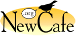
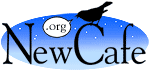
- The logo needed to incorporate the URL of the New Cafe so that new members could easily, intuitively find the site out there in the wild and woolly Internet.
- The logo needed to communicate that the New Cafe is about "talk." Plain, old-fashioned talk.
Dialogue, or discussion, is the cornerstone of the New Cafe, and is what brings more than 300 forums and almost 20,000 topics together under one roof, as well as people from nearly every country around the world.
The traditional font used in the logo mirrors the traditional, text-based format found in the New Cafe. It's nothing fancy, but the conversations that it represents are anything but plain.
The bird, capable of covering great distances, reflects the great breadth of topics available in the New Cafe. You don't have to be a bird to take in the scope of the New Cafe, but, if you were, it would certainly help.
The word balloon that contains the URL communicates that this unique site has been and always will be focused on talk Ś online talk, but discussion just the same. While other social sites depend on fancy features and sophisticated (and browser-breaking!) code, the New Cafe continues to draw its strength from the power of words within the context of discussion.
Finally, the sunrise background conveys a new day, a new opportunity to talk. In the New Cafe, discussions are constantly starting Ś some in long active topics, others in brand-new ones Ś and each visit brings multiple chances to participate. The evening background reminds us that these discussions continue well into the night and are available every minute, 24/7. The New Cafe is never closed!
Thanks again to Spanky for his fine work, and a special thanks to the members of the New Cafe for their inspiration.
Respectfully,
The Volunteer Logo Committee
 |  |  |  |
A little bit about our logo designer
User {spank}, who goes by ōSpankyö on the Internet and Mike Baker offline, has been a member of the Cafe since 1997.
He is husband to a schoolteacher and father to a little girl who likes to dress up as a kitty-bunny-ballerina-princess-fairy.He lives in Long Beach, California, with the aforementioned people, a cat, and a stream of "unexpected" dinner guests. He likes to cook and eat and talk about food. You can often find him drawing or reading with his daughter. At work in higher education, he is the media expert in his department, where he spends much of his time doing web design.